
Photo by Martin Dee
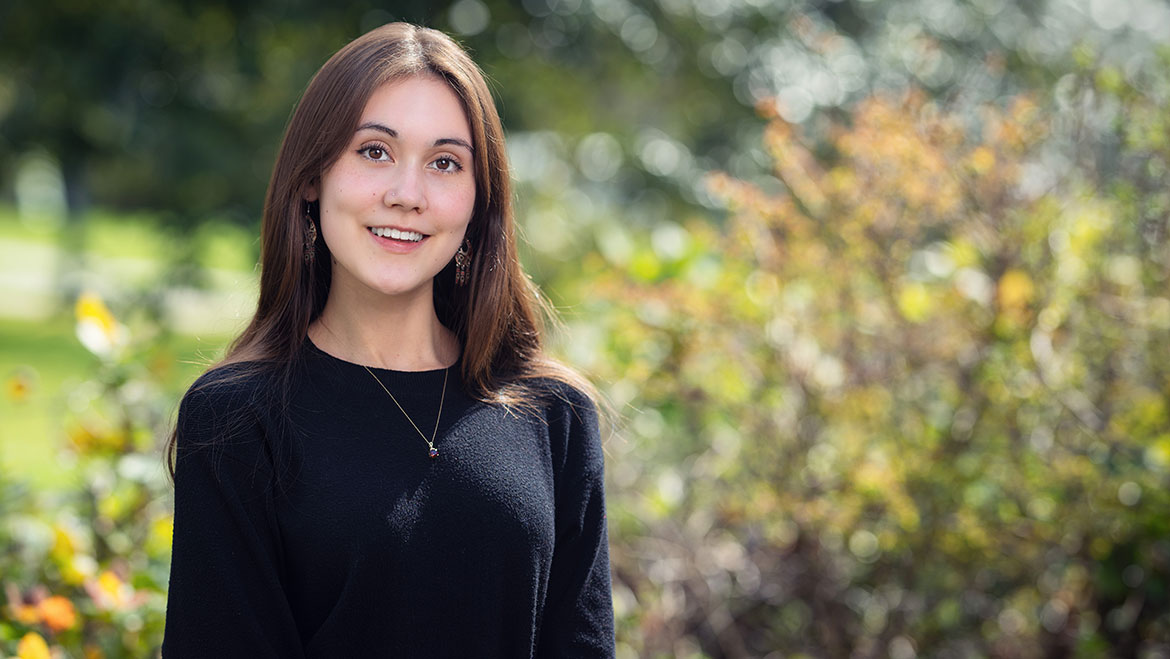
Koyah, which means raven in the Haida dialect, is from the t̓uk̓ʷaaʔatḥ (“Toquaht”) First Nation—a close-knit community west of Vancouver Island. Her ancestry is tied to multiple nations, including Bonaparte, a small member band of the Secwepemc (“Shuswap”) Nation.
Throughout the school year, Koyah actively maintains connections to her Indigenous roots by expressing her heritage through art. From working as a contract artist at the UBC Michael Smith Laboratories to incorporating her language and culture into class projects, Koyah’s efforts seamlessly weave traditional practices into contemporary academic and creative spaces. Koyah is currently in her second year studying Neuroscience at the Faculty of Science.
We interviewed Koyah about the artwork she created for the Indigenous Symbols and Signifiers initiative, which answers the question: What symbols represent belonging in your culture? Here’s what Koyah has to say.
About Koyah and her inspiration
Toquaht Nation, which is a nation on the western side of Vancouver—so, west of Vancouver Island. There are about 175 people in our community, and it’s just underneath Ucluelet. We’re very coastal people. Our reservation is actually right next to open water. There have been many mornings when I would sit and have my coffee and watch whales—gray whales, humpback whales, and sometimes an odd orca.
I’m not going back for the summer, but I’m actually going to be working at UBC. I’m an undergraduate researcher at Cernia Labs, which is a neuroscience lab located at the Djavad Mowafaghian Centre for Brain Health (DMC) on campus.
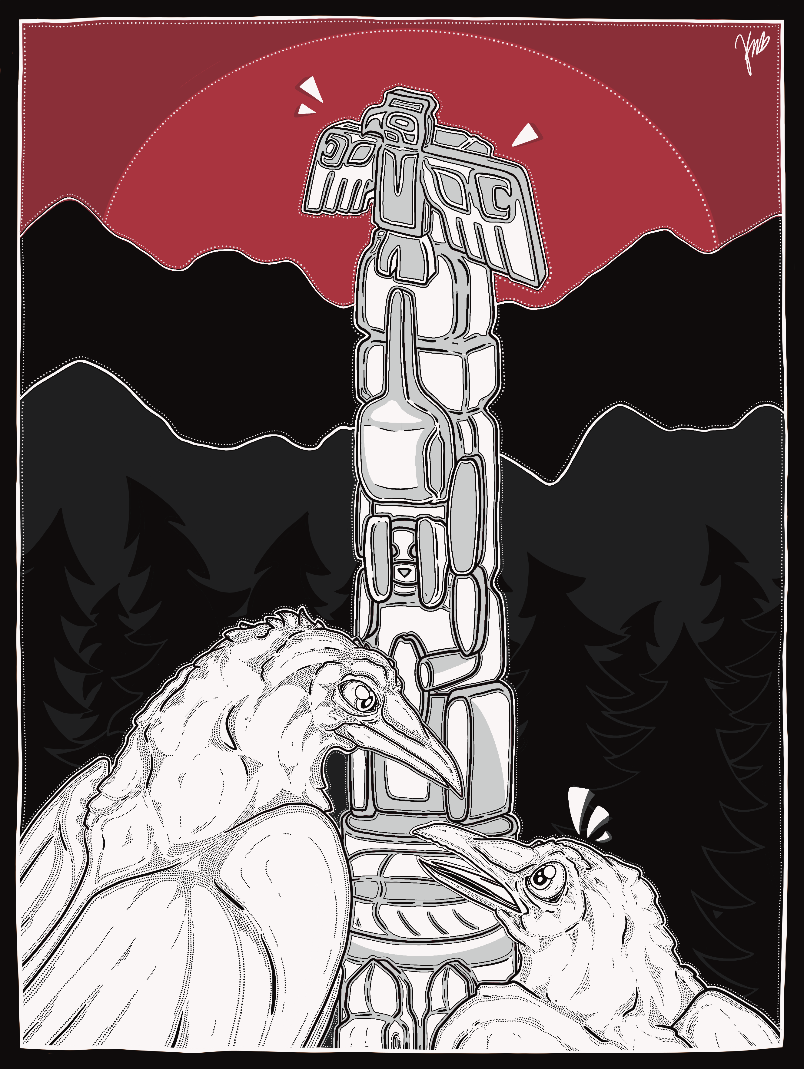
Koyah's artwork
Original artwork created by Koyah that highlights symbols from the Toquaht First Nation and the significance of the colour red

Toquaht Nation totem pole
Photo provided by Koyah
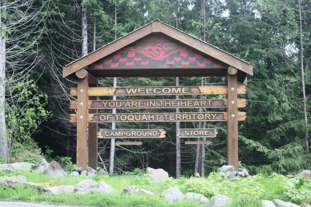
Welcome to Toquaht Nation Traditional Territory sign
Photo provided by Koyah
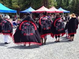
Toquaht Nation shawls
Photo provided by Koyah

Toquaht Thunderbird
Toquaht Thunderbird painting by Gale Johnsen. Photo provided by Koyah

Chief Cecil Mack Drum
Photo provided by Koyah
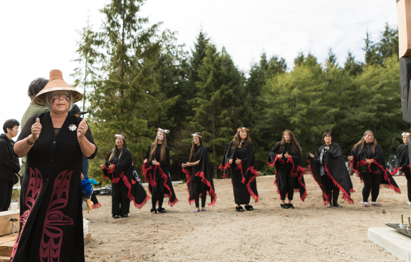
Chief Anne Mack and dancers
Toquaht First Nation Chief Anne Mack and community dancers. Photo provided by Koyah.
When the season turns red
With this piece, I wanted to highlight the significance of the color red. In a lot of traditional Formline artwork, colourways are very restricted. Growing up, we had a lot of artwork in our household, and most of it only used black, white, and red. So, when I find these combinations out in the world, I always associate them with my culture and the art of my people. I wanted to bring that into this project using my own style. So I drifted away from traditional Formline a little bit and added more of a comic pop art feel.
There’s a lot of cultural significance tied to red, especially when it comes to our resources. When I thought about red, I instantly thought of things like red cedar, the keystone species—sockeye salmon. I still have sockeye salmon in my freezer from our last round of fish. Just seeing that in my freezer was inspirational as well. Additionally, we have huckleberries, blackberry juice—so many important resources for Indigenous people are red, so I wanted to show that.
Sockeye, Ravens, and the red that lingers
For sockeye salmon, you can recognize that it’s trademark red. It’s much redder than other types of salmon. For me, it feels almost like a holiday when that season comes. The red color is very, very significant. Blackberry season in late summer has always been memorable, too. Your hands get so red when you’re picking them. I understand that blackberries aren’t red, but I always remember that part—the red stains.
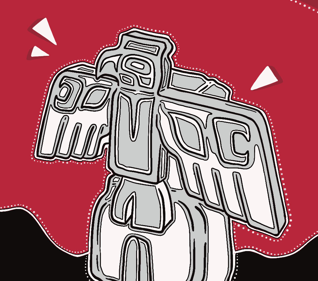

Thunderbird illustrated by Koyah
The ravens were kind of a spontaneous addition to the project. If you look at the design of the totem pole, it’s a rendition of a totem pole on the reserve where I’m from. The bird on top is a Thunderbird. I find that when I see everyday birds, like ravens and crows, I always associate them with that totem pole. It makes me feel at home. But for someone else, they might just see a bird and think, “Oh, that’s a crow,” without the same associations, because they grew up in a different environment. I wanted to highlight that we’re all collections of memories. These are my memories. This is how I see birds, I suppose. My name, Koyah, actually means “raven.” If you look it up online, I believe it’s from the Haida language. So that’s super cool—kind of aside from the project—but yeah, I had no idea until I learned that.
“There’s a lot of cultural significance tied to red, especially when it comes to our resources. When I thought about red, I instantly thought of things like red cedar, the keystone species—sockeye salmon—so many important resources for Indigenous people are red, so I wanted to show that.”
From Formline to pop art
One of the initial drafts I had for this project was a formline design. It was black, white, and red, which was my original goal. But when I looked at it, I felt like it was exactly what I grew up with. It was beautiful, and I love that so much. But I wanted to create something that showed a bit more of my personality and the style I use every day. So I tried something a little different from what I was used to.
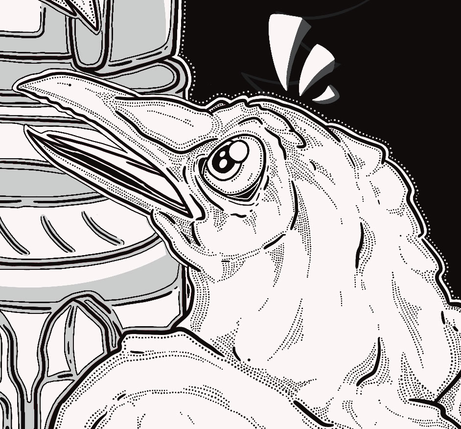

Raven illustrated by Koyah
Lately, I’ve been working a lot with traditional formline designs, but I wanted to step away from that, to try something with more creative flair. Something a bit more modern, possibly more interesting from a digital perspective. It’s super cool to use software that allows you to work with such fine details and pointillism. My head gets so tired doing it manually, so using the computer was awesome. I just tried to incorporate all the ideas I was feeling in the moment and submit something a little outside the box.
